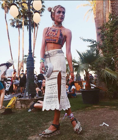
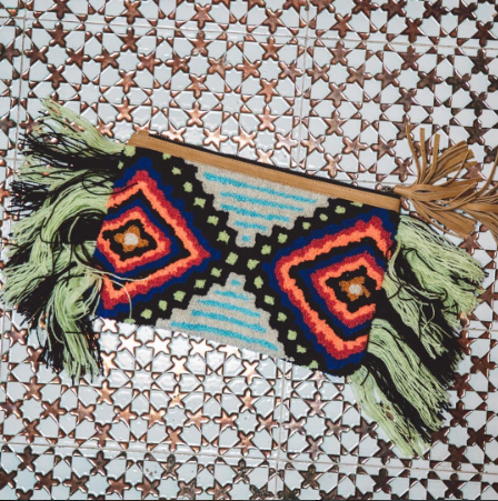
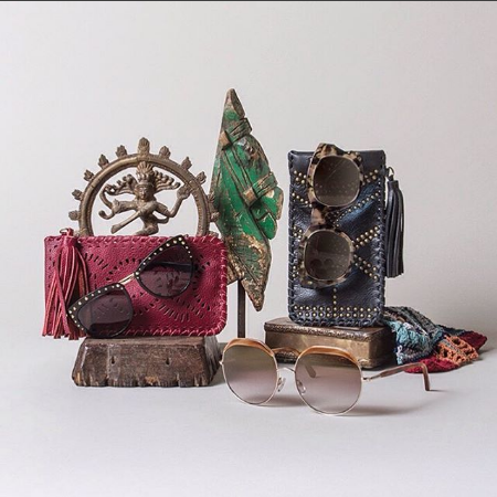
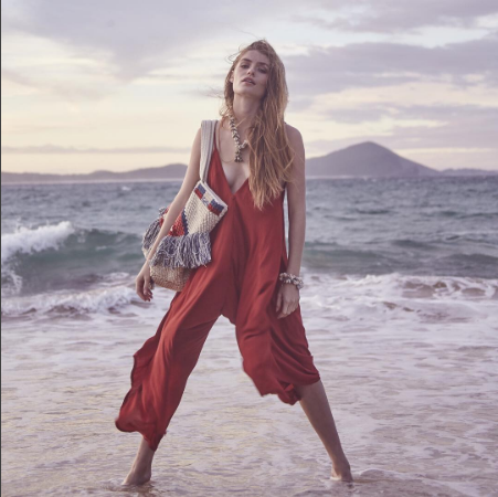
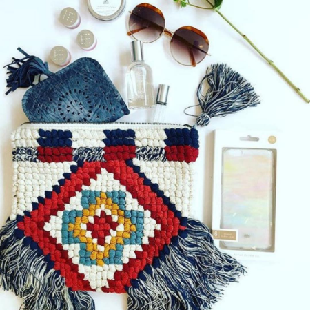
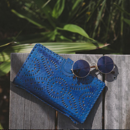
Cleobella is a handbag and accessories company based out of Sunset Beach, CA. They are known for their handcrafted products from Bali and Mexico, which lends to their worldly aesthetic. With Cleobella’s new site, we really wanted to showcase their unique aesthetic, beautiful photography and gorgeous handbags. The goal was to balance our clean and luxurious aesthetic with the simple and easy-to-use functionality required to increase online sale conversions.
Thanks again to the entire Cleobella team for their grateful nature – we are so happy you guys love your new site!
“It was such a pleasure to work with true professionals. I would recommend the team at Syndctd to anyone I know. They guided us in this detailed process from start to finish and we could not be more proud of the website they built for our brand. We have already seen a growth in sales in our shopping store, which was our ultimate goal! I look forward to our continued partnership together in evolving our website for years to come.”
Thank you,– Angela
Due to the ever-changing nature of the fashion industry, it was very important that the client be able to maintain and continually update their site for the new seasons. Cleobella.com was developed through WordPress and Shopify to facilitate client usability. Both platforms’ themes were highly customized. At the end of development, we created a detailed guidebook with screenshots and step-by-step instructions on how to use their robust new site.
To streamline the customer flow and funnel users through to the purchase point, we created a category grid on the homepage that directly links to featured products in the store. The homepage slideshow and adjacent tiles all call attention to different collections of highly visual products, enticing the user towards purchase.
Cleobella is extremely popular for their boho chic style in the fashion world and they receive lots of attention in celebrity and fashion press outlets. To highlight this we formatted the press stream in a picture grid format. The grid gives an overview of how extensive their reach is, while clicking into the post gives a more detailed view of the story. This striking grid-view also extends into the representation of blog articles.
IN THE STORE
To simplify customer flow, we included a side-bar navigation listing all sub-categories. Though most of their products are one of a kind, there is a large portion of products that feature a range of color choices. To make customers aware of all the options available, we created color swatches that appear on the preview category page.
To continue this feature onto the product page, we developed the functionality allowing the customer to view different color options by clicking the swatches. Overall this creates an engaging and visually appealing way of portraying the vast amount of options available in Cleobella’s products.
You can visit the Cleobella site here.
