Viewing entries in
Design

Las Vegas Monorail

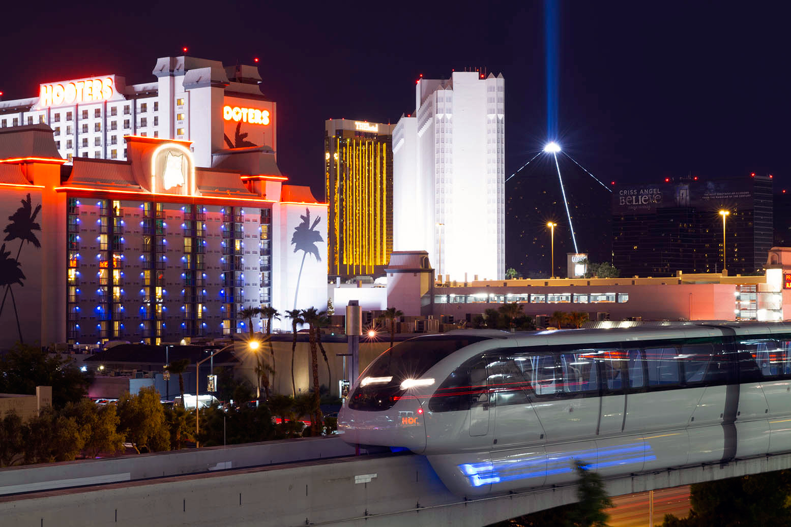
Syndctd was engaged by the Las Vegas Monorail Company to fulfill two creative projects for them. We were to redesign both of their consumer and corporate facing websites. To accompany the redesign of these websites with stylish new assets, Syndctd was also commissioned to do a photoshoot of the monorail.

Our team and crew traveled to Las Vegas for two days. Through these photos we wanted to portray the convenience that the Las Vegas Monorail gives it users. Photos were taken from neighboring attractions like hotels, the convention center and golf courses, to show the accessibility of the monorail. The monorail, being a transportation unit, is not the most visually stimulating subject. Our team strived to achieve creative and engaging photographs by shooting from different angles and in different lighting situations. Below are a few selects from our shoot.

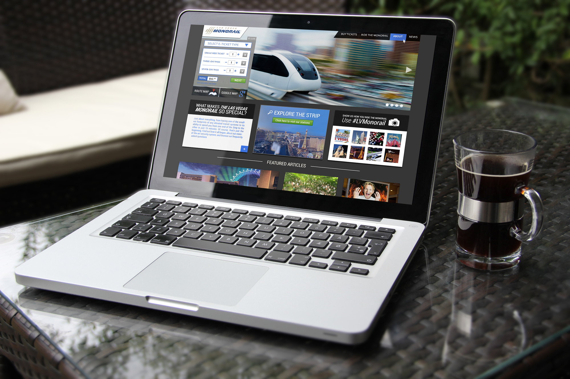
For the consumer-facing site, we aimed to create a modern aesthetic that would portray the Las Vegas monorail as a cutting edge technology and relevant company. To create engaging content for the user, the site showcased plenty of visual content, including the monorail’s new photographs. The homepage highlighted a wide screen slideshow, Instagram feed and six featured blog articles. The larger Las Vegas Monorail blog is housed under the “News” section. Blog articles keep users informed about events, attractions and other enticing information that are happening around and are easily accessible by the monorail. Each page of the site also featured a quick line to the “Purchasing Pop-up” window, which allowed for fast purchasing and checkout.

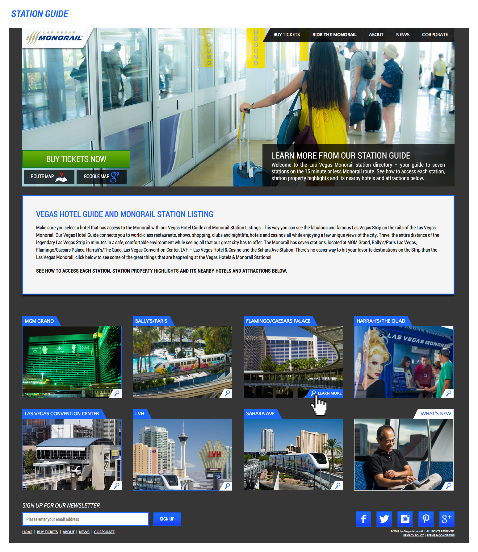
The majority of the content in the site was organized around the seven monorail stations. The Station guide page gives the user a general overview of the layout of the Las Vegas Monorail line. It was important that this new site conveyed to riders that the monorail was easy-to-use, efficient and convenient.

Each thumbnail leads to the individual station guide pages. These pages each contained three featured blog posts pertaining to that specific station, a wide screen slideshow and the timeline. The timeline dynamically displayed how much time it would take a rider to get from their current station (the page they are on) to another station along the monorail line.

The Las Vegas Monorail site also encompassed the corporate facing side. This portion of the site houses all of the administrative and financial information that is required to be displayed for their investors. Visually the corporate site is reflective of the user-facing site’s modern aesthetic, but much refined for its professional audience.

Overall, the new Las Vegas Monorail site aimed to educate users to the benefits of using their public transportation system and entices them to buy tickets and ride. The purchase funnel was greatly simplified to ease the process. The site is also fully responsive, allowing users to get needed information on the go (like while riding the monorail). So the next time you are in Las Vegas and don’t want to wait in the taxi line, ride the monorail.
 

My Madison Resort - Ariel Content Production and Website Build

Having the opportunity to work with a property as exquisite as the “Madison Resort” was very exciting. The home boasts a host of incredible architectural feats with uncompromised detail, premium craftsmanship, numerous customized features, and so much more. The project was focused on providing a digital selling tool for the property owner and management catered specifically to high-end buyers with an eye for unique architecture. It comprised of a video showcase of the property and a full website build with carefully curated copywriting. The process was relatively straightforward: create a short teaser video of the property, and upon watching the video potential buyers would be encouraged to inquire further via email. Once vetted by a professional real-estate team the potential buyer would be given private access to a website which would contain specific, highlighted details about the property.


The Video

Given the scale of the property and the immense amount of detail within every inch of its design, our biggest challenge was to be able narrate this within a short video. We partnered with the directors from Pentatonic Productions and the camera crew from Wild Rabbit to tackle this exciting, albeit challenging project. Wild Rabbit Aerial are predominantly known for their phenomenal aerial photography capabilities and coupled with Pentatonic’s new addition to the family (the Sony PMW-F5 Cinealta camera) the team was able to capture and produce some stunning results (see video above). This was Syndctd’s first foray into a production of this nature, and it was met head on with enthusiasm and tenacity.

Maiden-Voyage-F5+Wild-Rabbit-1024x682.jpg

The Equipment

Shot on the Sony PMW-F5 Cinealta camera in 16 bit 4K RAW, 120 frames per second with 14 stops of cinematic dynamic range. These cameras were used to capture the slow motion ultra high definition replays for this year’s super bowl on FOX. 4K offers the client the confidence of future proofed media as our media distribution world and televisions head towards ultra HD or 4K broadcast. 4K raw footage used 512gb of storage media in 65 mins of shooting. In camera compressed 4K or 2K would lower this data rate considerably.

Large capacity camera drone octocopter with custom-engineered three axis brushless camera gimbal produces stunningly stable imagery carrying the Sony F5. Wireless HD monitoring stations and long range FPV w/ on screen flight data allows the team to fly safely and achieve complicated shots before thought impossible. Average flight times running at 8-12 mins depending on flight conditions and camera movement.


The Website

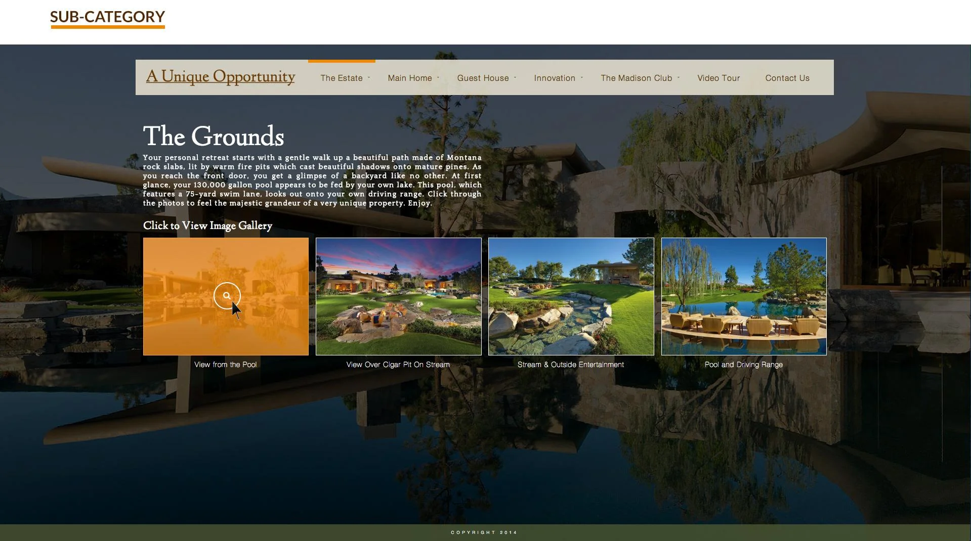
To uphold the exclusivity of this property the website required a password for entry. Once inside a full-screen visually focused site captivates the viewer. There was a database of brilliant photos taken of the stunning property that brought the site to life. The aesthetic of the site was kept very simple in order to showcase the beautiful photographs.

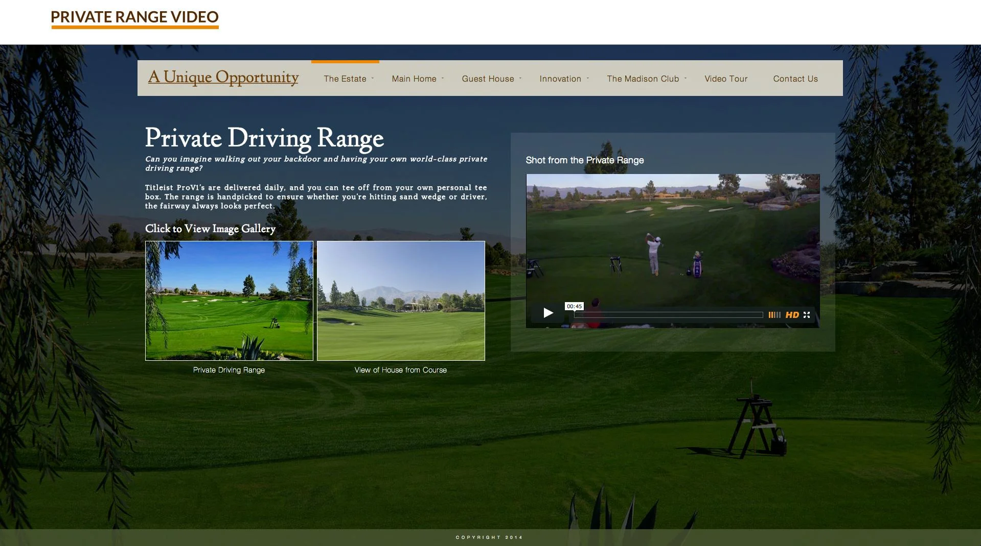
The aerial footage produced is presented in two sections of the site. The Private Driving Range page highlights the snippet of the larger video that features Pro Golfer Pat Perez teeing off from the property’s range.

Viewers can get the fully immersive picture of the property by watching the Video Tour. To exhibit the footage at its highest quality, the video was embedded through Vimeo Pro and played in HD. The viewer could also expand the video to full-screen.

Working for this client and unique property was a great opportunity for Syndctd to expand and showcase its video content services. Through the video and site, we strived to show the audience the beauty of such an expansive home.


One Santa Fe - Website, Social Media and Photoshoot

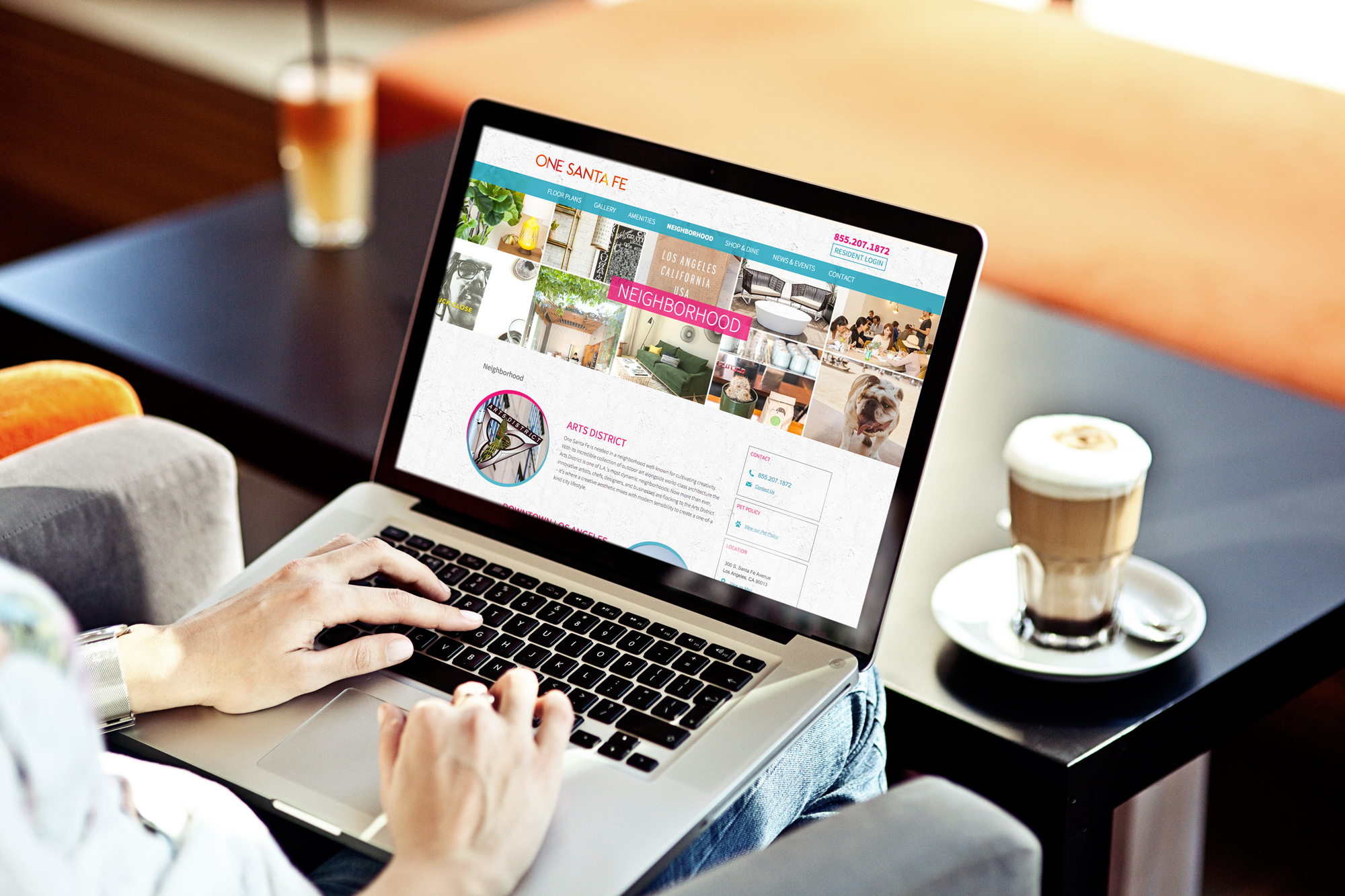
One Santa Fe, the eclectic Arts District mixed use property development was designed by the world renowned architect Michael Maltzan. In 2012, the $160+ million dollar project broke ground and construction of the 510,000 square foot property was immediately underway!

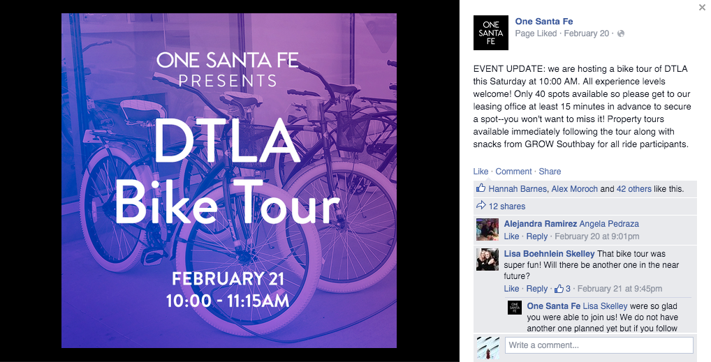
In January 2015, the building opened for leasing and Syndctd was brought in to help drive users from Google and Social Media Platforms to the One Santa Fe website to learn more about the property and turn LEADS into LEASES.

Social Media Management & Creative Content Development

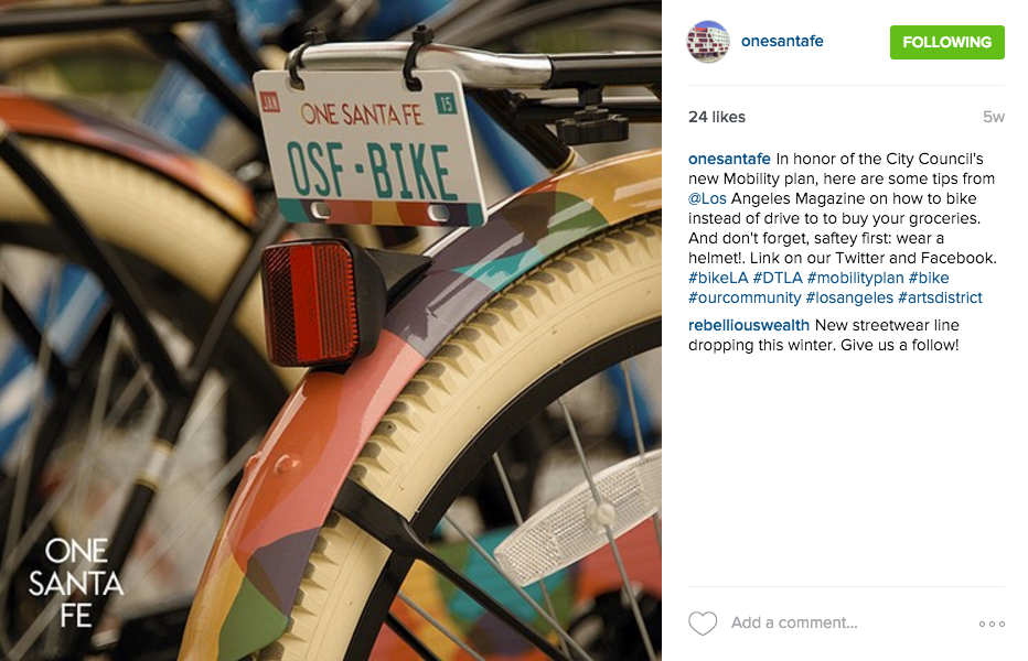
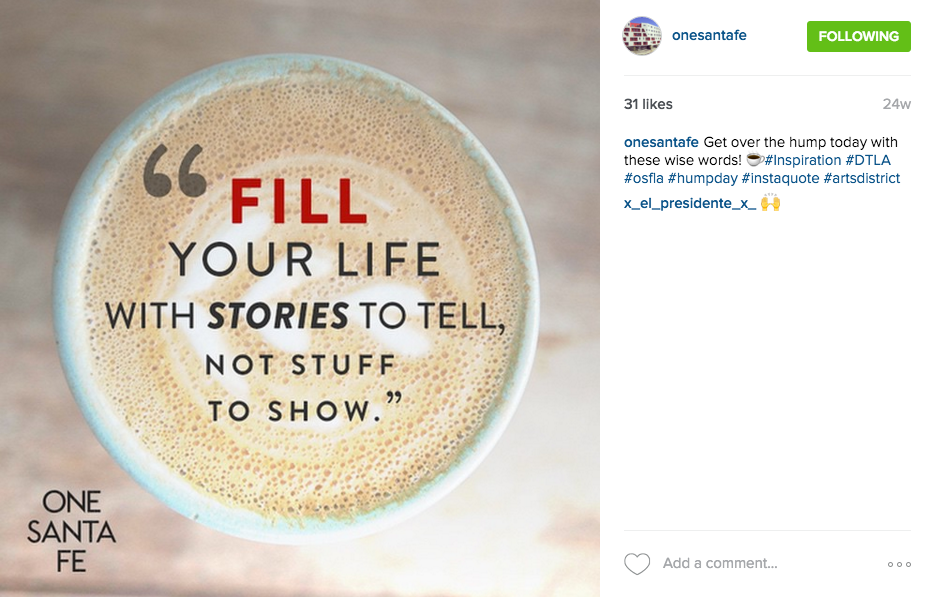
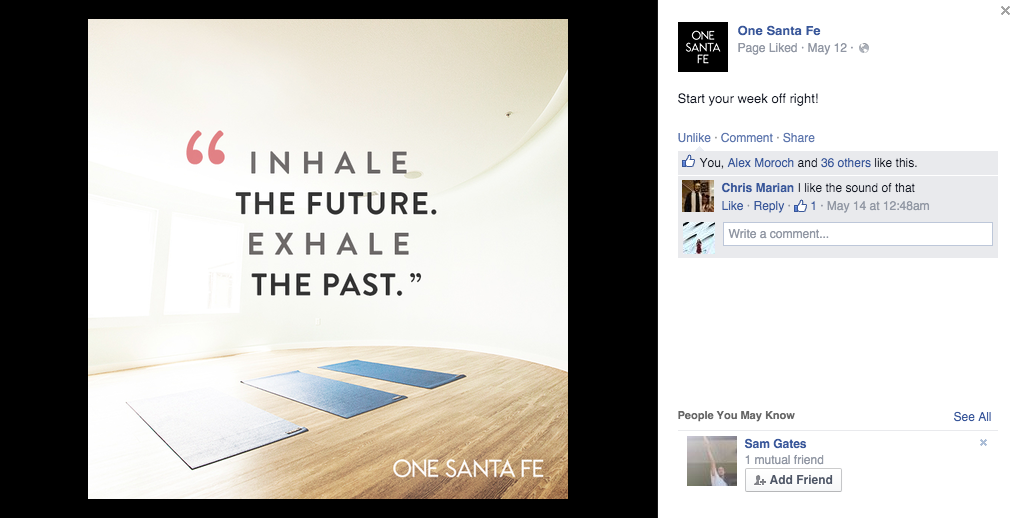
  • Daily Management of Facebook, Instagram, Twitter and Google+
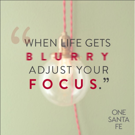
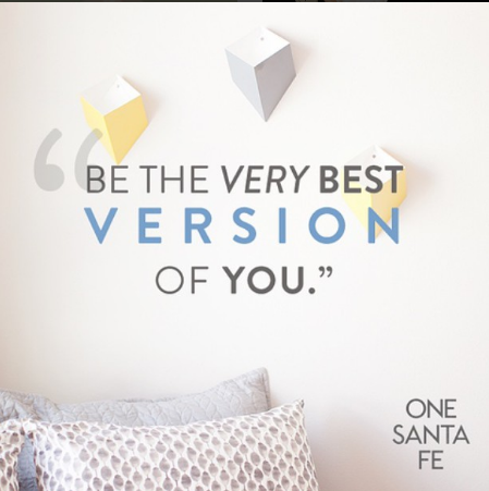
  • Image Creation and Copywriting for posts 5+ times per week
  • Crisis Management + Brand Monitoring
  • Advanced Social Reporting + Weekly Digital Strategy Sessions with One Santa Fe marketing staff

WEBSITE REDESIGN + Photoshoot of Property and Community

  • ReDesign of Property Website with integration to their existing property management backend
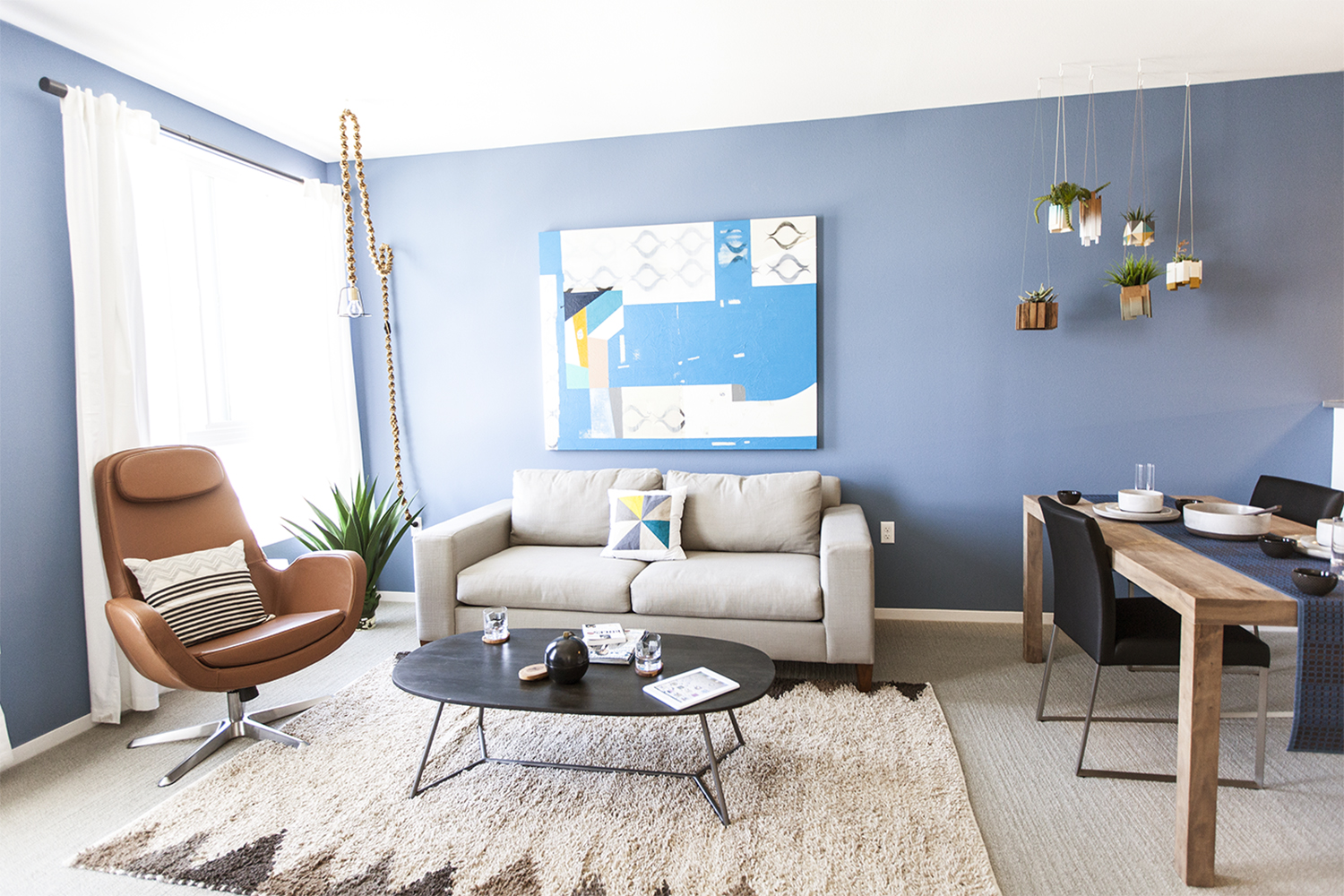
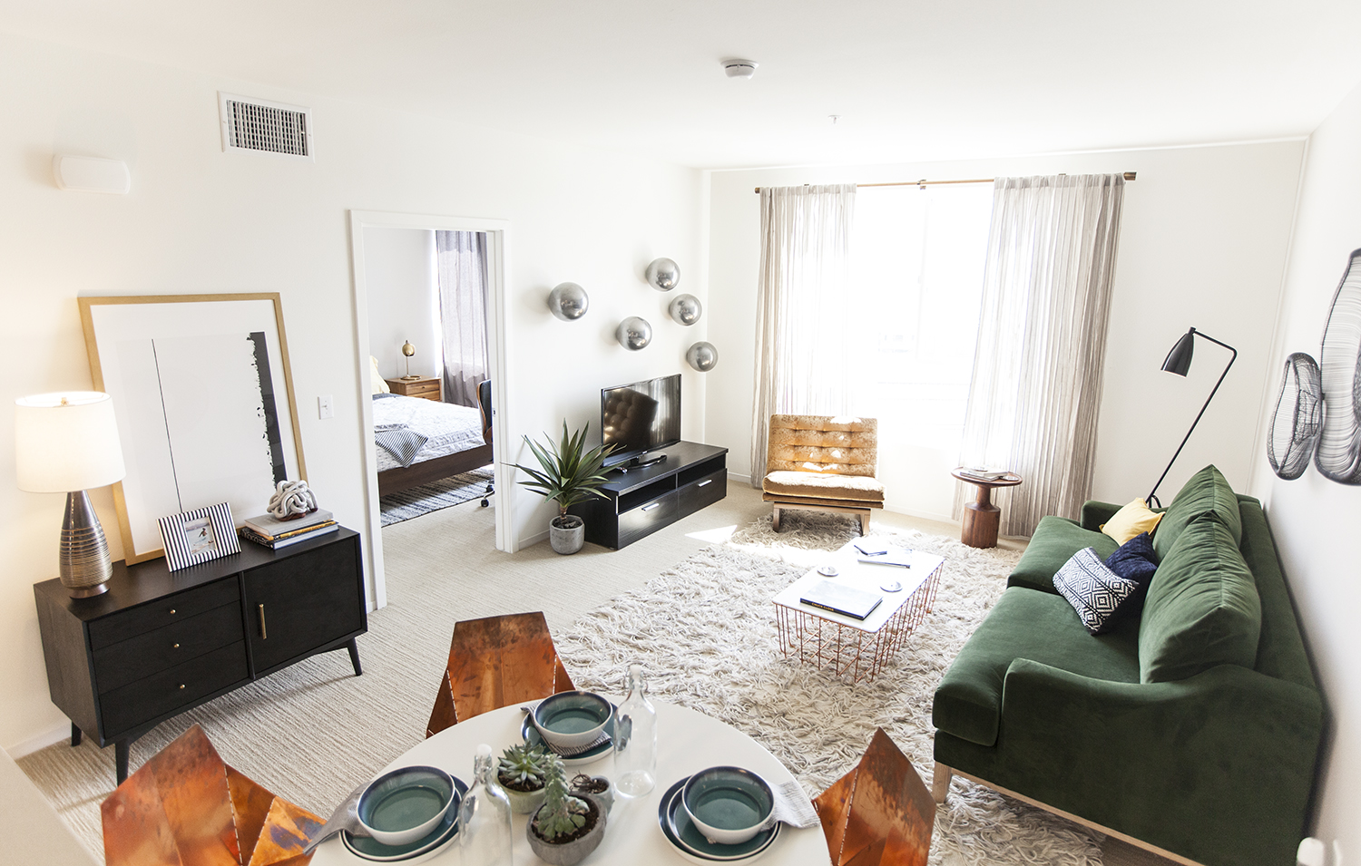
  • Photoshoot for social and web assets: Studio, One Bedroom, Two Bedroom and Townhome
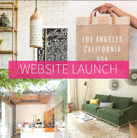
  • Lifestyle Photography around One Santa Fe

Paid and Organic Search

  • Paid Advertising: Facebook, Google AdWords, YouTube, Instagram and Twitter
  • Organic Search: SEO Website Overhaul and Production of Blog Content for Site

Key Initiative

Our Search and Display campaigns drove users back to the osfla.com page to gain knowledge regarding the different unit offerings. Additionally, we ran an extremely successful video campaign that generated approximately 40,000 views with the help of media support; specifically through TrueView In-stream Ads, Standard Display Ads and In-video Overlay Ads.

Facebook advertising was also invaluable and garnered the most conversions for lease submission inquires at One Santa Fe. As advertisers, the Facebook Targeting algorithm gives us the opportunity to identify specific target audiences by geographic and interest criteria within their network. This was key to get into the mind of the coffee-sipping consumer when generating this particular social campaign.


Campaign Insights

Working on Social Media, Paid Media Campaign Creation and Management and Photo Content Development in the last year has helped to drive leases for the property – and more importantly, also sets the tone for the kind of life people want to lead at One Santa Fe.

Traffic to Website from Paid and Social: 17.6K Unique Visits

  • New Sessions: 60.4%
  • Referral Traffic: Social and Paid- 55% // Direct – 25% // Organic – 20%
  • As of November 2015, One Santa Fe is at 90% Occupancy rate.  

Schwarzkopf Professional - Educational Microsite

Syndctd designed and developed a microsite on behalf of Schwarzkopf Professional, a Henkel brand. Syndctd was tasked with ideating a concept that would work to gamify the needed educational material for hair designers, a group with a notoriously short attention span. Syndctd solution was to develop the microsite featured below!

Rhea Footware - Brand Identity and Content Creation

Syndctd was retained to help Rhea Footwear with their brand identity and creation of both photo and video content for web, social and EMS. We coordinated a brand discovery session to create the brand’s tone of voice and identify the keywords needed to describe the brand, its audience, and products’ emotional benefits.

Branding and Brand Discovery

Rhea – The Brand
Safety
Innovative
Compassionate
Premium

Rhea – Emotional Benefit
Security
Confidence
Peace of Mind
Hip & Trendy

Rhea - The Tagline

Designed With Your Sole in Mind

Rhea – The Audience
Prevention Minded
Concerned – Family Oriented
Active Lifestyle
Appreciates Fun / Technology


Video and Photo Treatment

Rhea is a family oriented shoe. We know that we can target young moms and dads who value safety for their children, their parents and for themselves. In the digital lookbook and video, we feature the active lifestyle of these families in their non-slip shoes.

Q-See - Branding, Production + Event Activation

Syndctd was retained by Q-See, a premium surveillance system brand, to strategically rebrand all of their visual creative and marketing messaging. The surveillance camera market is rapidly expanding with increased interest from a younger demographic, which typically gravitates towards sleek design, streamlined software usability, and seamless integration into their busy lives.

Q-See had initially positioned themselves as a premium brand geared towards the traditional surveillance system market demographic - older home and business owners. However, their demo shift to a younger, more tech-savvy audience created the need for fresh, updated messaging and visual aesthetics. Syndctd redesigned all global product packaging, domestic and international retail displays, online advertising, and buyers’ sales presentations. We developed several Q-See experiential activations for retailers like Home Depot and led strategy and production for Q-See’s presentation at CES in Las Vegas this year. 

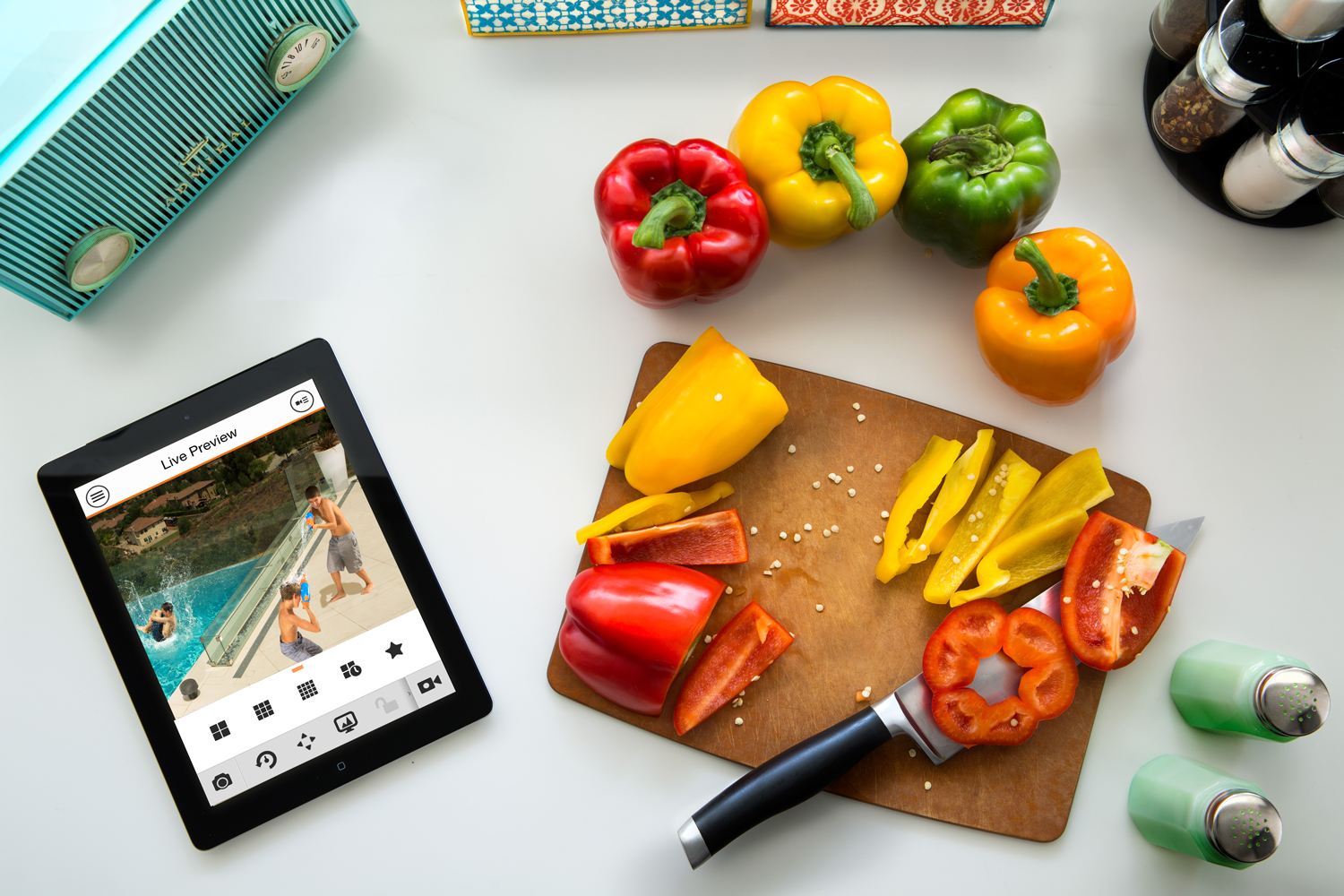
Below are some of the photos taken by Syndctd's creative team for use within Q-See's marketing mix:

RETAIL PACKAGING

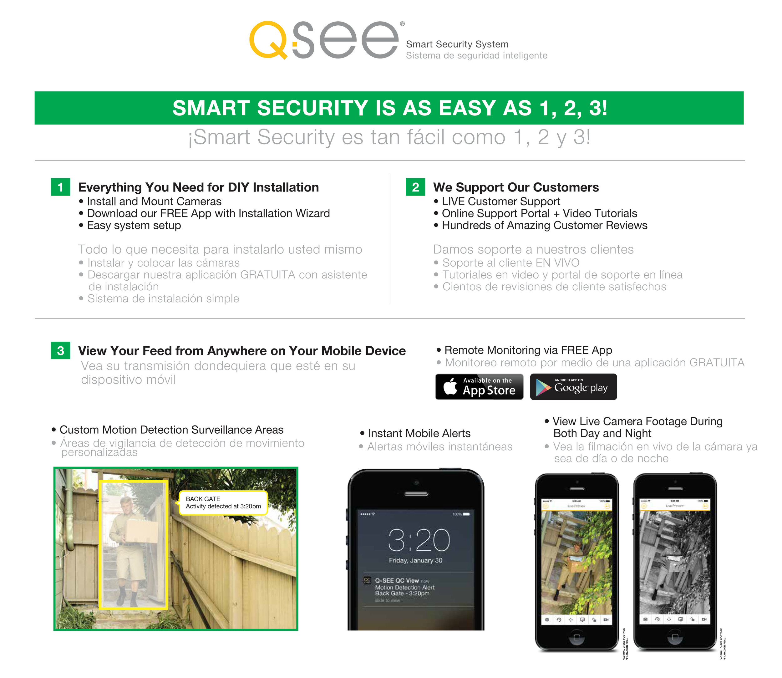
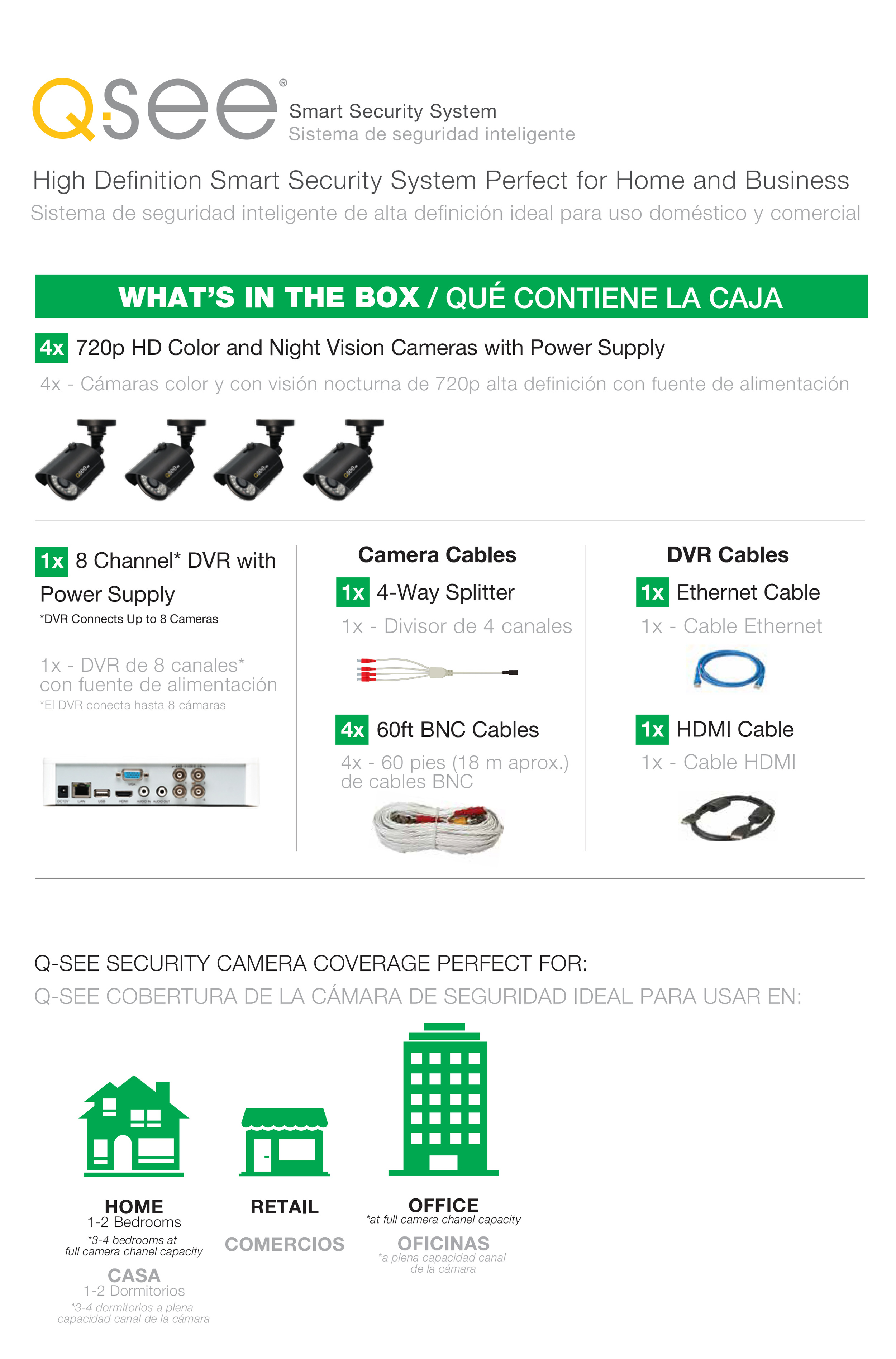
The biggest component of the rebranding project focused on Q-See’s retail packaging. Our main goal was to streamline their message to more efficiently educate their customers on the core benefits of owning a Q-See system.

The new packaging featured a visual representation of all pieces included inside the box, a visual explanation of the mobile surveillance features, a breakdown of the easy 3-step installation process, and a guide to choosing the correct system for the customer’s space.

We revamped the package’s aesthetic to appeal to the more modern customer while staying sophisticated, inviting, and reassuring. We reorganized their product offering based on use-case and designed a new color system to classify the audience groups for each level of system. To visually convey these classifications, Syndctd produced a photo shoot to develop new imagery for the front cover. The packaging clearly delineates between each type of system and the user it’s best suited for.

WELCOME BOOKLET

Syndctd completely rewrote and redesigned the 24-page Welcome Booklet included in every system package. We streamlined the installation guide, refined all instructional steps and developed technically illustrated diagrams. Because Q-See’s products are global, it was vital the diagrams were easily understandable without reading the instructions. The new Welcome Booklet was translated into 7 languages with dividing tabs and printed as one pamphlet.

Our main goal in the rebranding of Q-See was to most effectively educate new consumers on the numerous ways that owning a Q-See system will enhance and clearly benefit their lives. Individual security surveillance should bring its users peace of mind knowing the best quality product is protecting their family, property, and livelihood.

Stones Throw - Branding, Film Marketing + Film Distribution

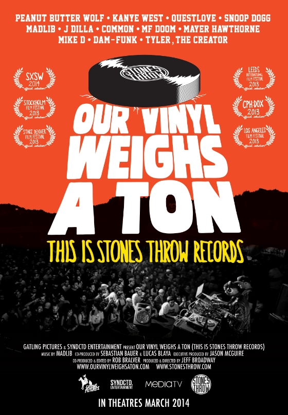
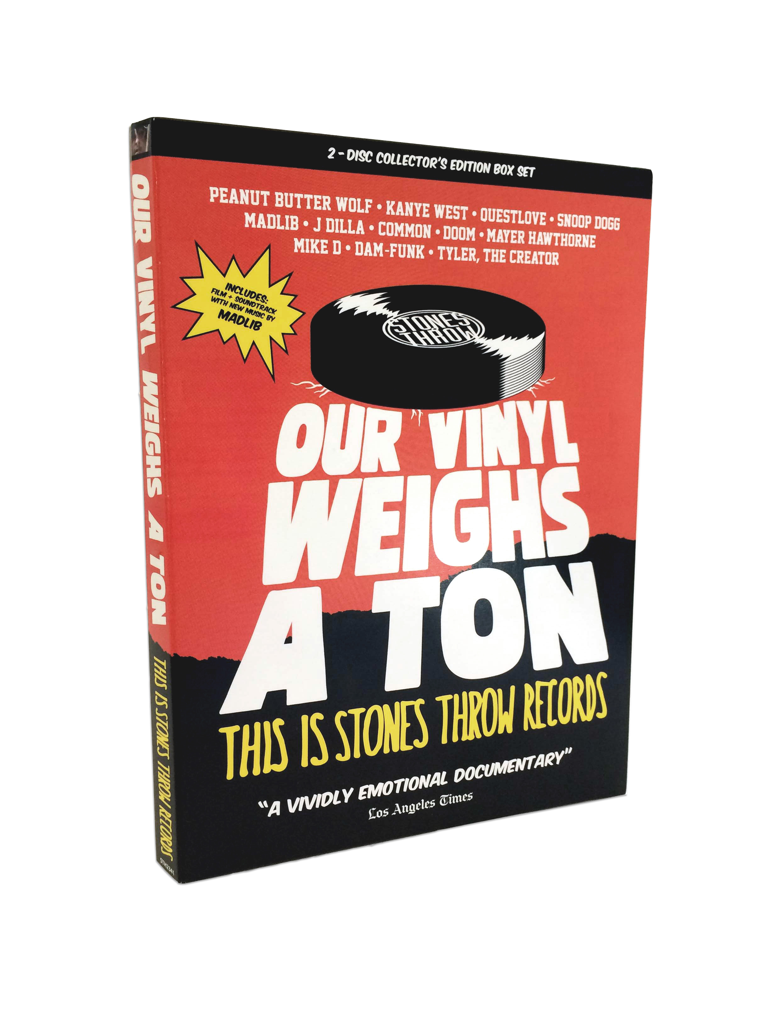
Syndctd was brought on to support the development and release of the original documentary “Our Vinyl Weighs a Ton: This is Stones Throw Records”.  The film centers around a Los Angeles-based independent record label that has produced many prolific Hip Hop artists over the years. The films brand identity was developed from scratch by Syndctd and was very influenced by Stones Throw’s old school Hip Hop aesthetic.

Branding & Logo Development

The logo was the first step in the development of the documentary’s identity. Several logo mockups were developed visually playing off the film’s title. The hand written aesthetic of the chosen logo treatment lent itself very well to the culture of Stones Throw. This aesthetic carried over into the design of the movie poster with the hand written laurels and torn background texture.


DVD Packaging Design

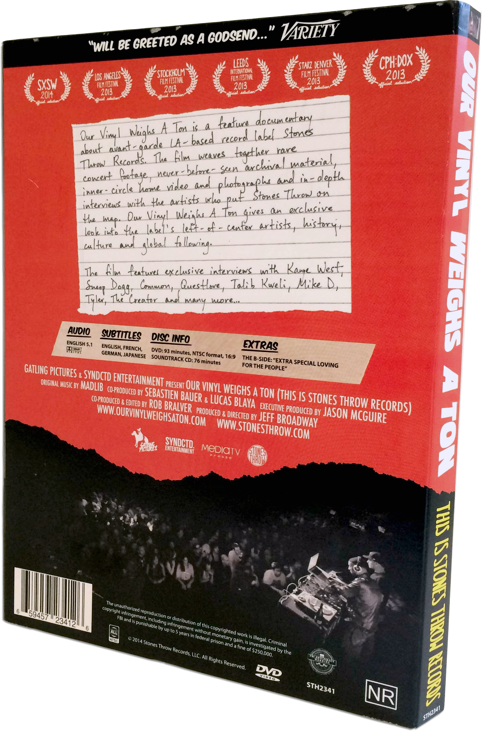
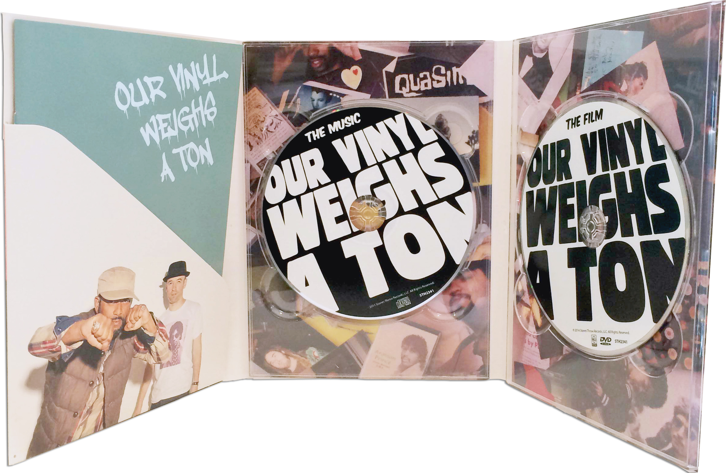
Syndctd was next tasked with developing the DVD set. Elements of vintage comics were incorporated to compliment the continued ‘hand-written’ aesthetic. The 2-Disc Collector’s Edition DVD Box Set included the soundtrack along with a 6-page curated booklet. The booklet includes a handwritten soundtrack listing, elementary school essay written by Peanut Butter Wolf and collection of old personal photos from the Stones Throw founder.


Microsite

Syndctd also designed and developed the film’s microsite, which featured a ticket buying portal during the theatrical run. Similar to the social media that was created, assets from the poster were reinterpreted to keep branding consistent and recognizable through all online channels. 

Cleobella - Website Design

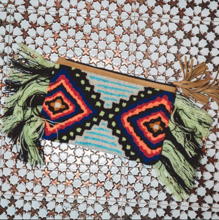
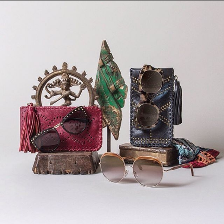
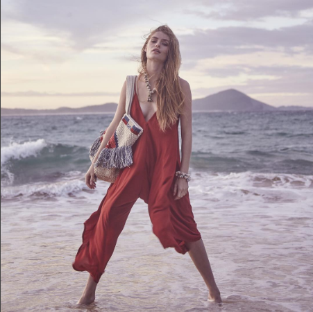
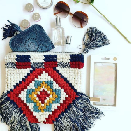
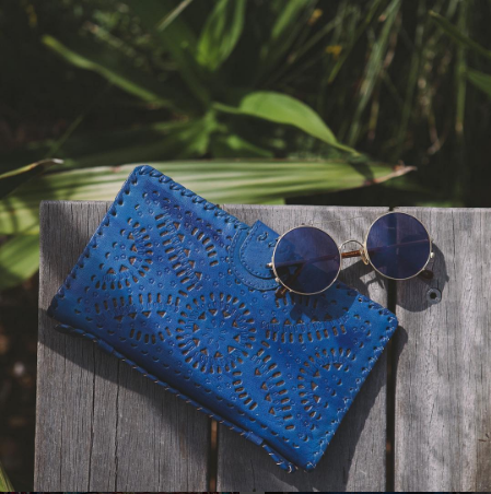
Cleobella is a handbag and accessories company based out of Sunset Beach, CA. They are known for their handcrafted products from Bali and Mexico, which lends to their worldly aesthetic. With Cleobella’s new site, we really wanted to showcase their unique aesthetic, beautiful photography and gorgeous handbags. The goal was to balance our clean and luxurious aesthetic with the simple and easy-to-use functionality required to increase online sale conversions.

Thanks again to the entire Cleobella team for their grateful nature – we are so happy you guys love your new site!

“It was such a pleasure to work with true professionals.  I would recommend the team at Syndctd to anyone I know.  They guided us in this detailed process from start to finish and we could not be more proud of the website they built for our brand.  We have already seen a growth in sales in our shopping store, which was our ultimate goal!  I look forward to our continued partnership together in evolving our website for years to come.”
Thank you,
– Angela

Due to the ever-changing nature of the fashion industry, it was very important that the client be able to maintain and continually update their site for the new seasons. Cleobella.com was developed through WordPress and Shopify to facilitate client usability. Both platforms’ themes were highly customized. At the end of development, we created a detailed guidebook with screenshots and step-by-step instructions on how to use their robust new site.

To streamline the customer flow and funnel users through to the purchase point, we created a category grid on the homepage that directly links to featured products in the store. The homepage slideshow and adjacent tiles all call attention to different collections of highly visual products, enticing the user towards purchase.

Cleobella is extremely popular for their boho chic style in the fashion world and they receive lots of attention in celebrity and fashion press outlets. To highlight this we formatted the press stream in a picture grid format. The grid gives an overview of how extensive their reach is, while clicking into the post gives a more detailed view of the story. This striking grid-view also extends into the representation of blog articles.

IN THE STORE

To simplify customer flow, we included a side-bar navigation listing all sub-categories. Though most of their products are one of a kind, there is a large portion of products that feature a range of color choices. To make customers aware of all the options available, we created color swatches that appear on the preview category page.

To continue this feature onto the product page, we developed the functionality allowing the customer to view different color options by clicking the swatches. Overall this creates an engaging and visually appealing way of portraying the vast amount of options available in Cleobella’s products.


You can visit the Cleobella site here.